Visualizing the Symphony: The Identity of Guatemala's National Orchestra
The Orquesta Sinfónica Nacional de Guatemala (OSN) is more than a musical ensemble; it is the heartbeat of the country's cultural heritage. Founded in 1936 and officially established as the National Symphony in 1944, the institution was declared "Cultural Heritage of the Nation" by Congress in 1991. However, by 2011, this historic institution needed a visual identity that could match its prestige. That year, I had the honor of winning the national design competition to create the new official logo for the OSN, a project that allowed me to translate the language of music into a lasting graphic symbol.
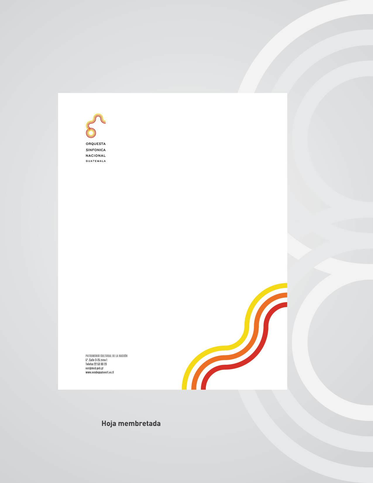
The challenge set forth by the contest was rigorous: the new logo had to avoid the cliché of depicting a single instrument (like a violin or trumpet) and instead capture the essence of the entire orchestra. My winning proposal was born from a conceptual abstraction of the orchestra's initials, "OSN," fused with the fundamental elements of music notation. The design deconstructs the quaver (eighth note) to form the body of the logo , intertwining it with the lines of a musical staff (pentagram). This integration represents the harmony between sound and silence, creating an organic form that suggests movement and rhythm rather than static imagery.
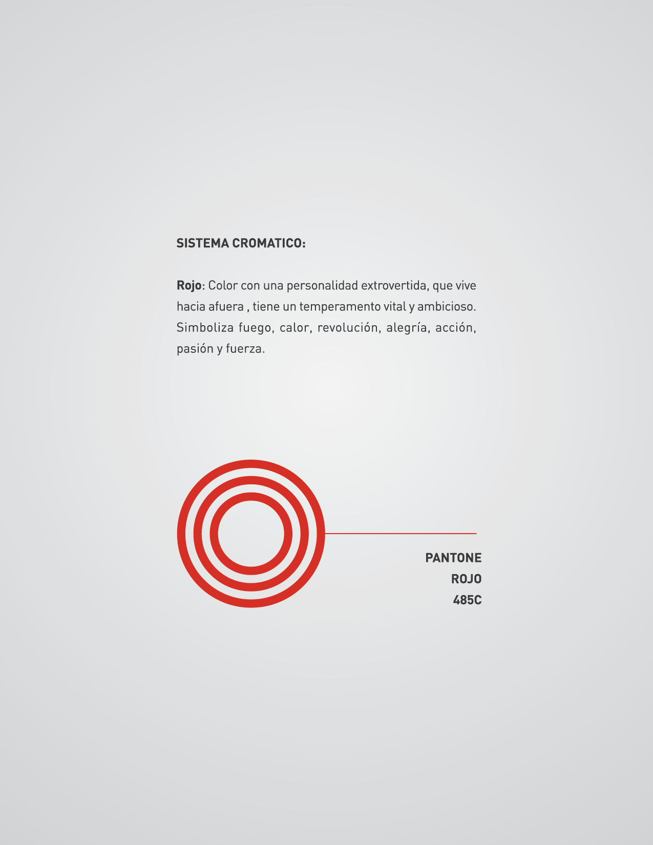
To bring this concept to life, I developed a vibrant chromatic system that moved away from the traditional, somber black-and-white association of classical music. I selected a palette of Yellow (Pantone 012C) to represent intellect and light , Orange (Pantone 021C) to symbolize enthusiasm and emotion , and Red (Pantone 485C) to embody passion and strength. These colors were paired with a strong typographic system using Tungsten and Bryant fonts to ensure the brand felt modern and accessible while retaining its institutional weight.
The launch of this identity marked a new era for the organization. The logo was not merely a cosmetic update but a functional system designed to work across everything from concert programs to digital media. It successfully met the competition's objective to create a definitive symbol for the orchestra, standing out among entries for its ability to synthesize the complexity of a symphony into a single, fluid stroke.
Today, this design continues to serve as the official face of the Orquesta Sinfónica Nacional. Its relevance was recently underscored in 2024, when the orchestra was awarded the Orden del Quetzal by President Dr. Bernardo Arévalo, the nation's highest honor. Seeing my work accompany the orchestra through such historic milestones confirms that a well-executed identity does more than identify; it elevates the institution it represents, resonating with the public just as powerfully as the music itself.


The Unseen Evolution: A Rebranding Proposal for the OSN (2023)
In 2023, more than a decade after designing the original identity for the National Symphony Orchestra of Guatemala, I embarked on a self-initiated challenge to evolve the brand for a new era. As the digital landscape shifted, I felt the need to revisit my original 2011 creation—not to replace it, but to refine it. The goal was to strip away the complexities of the original design and distill the concept into its purest geometric form. This proposal aimed to improve legibility across modern digital platforms, transforming the organic curves of the "musical staff" concept into a bolder, more structural icon that utilized 90% of the visual area for maximum impact.
The centerpiece of this rebranding was a cleaner, monolinear interpretation of the classic "OSN" quaver symbol. By harmonizing the stroke weights and tightening the grid, I created a logo that felt less like a drawing and more like a modern seal—avant-garde yet timeless. A key component of this proposal was a modular system designed for the orchestra's 88th Anniversary, featuring a custom "88" monogram constructed from the same rhythmic lines as the main logo. The project extended beyond just a logo, envisioning a comprehensive visual ecosystem that included mobile app interfaces, concert tickets, and merchandise, all unified by a warm, sophisticated palette of terracotta and deep charcoal.
Although this rebranding was never officially implemented, it remains a vital chapter in my portfolio. It represents the dialogue between a designer and their own past work—a demonstration of how a brand can mature alongside its creator. While the 2011 logo stands as a part of national heritage, this 2023 proposal stands as a testament to the power of iteration, showcasing a vision where tradition meets the sharp precision of contemporary design. It serves as a "Director's Cut" of the OSN identity: a glimpse into a potential future where the visual language of the orchestra sings with renewed clarity and strength.


